
In Part 1, I focused on readying the data for the visualisation. As far as the actual visualisation starter was concerned we got to the point of setting up the SVG with the boundaries projected. Now, we need to pick up our crayons and do some colouring in!
Before proceeding, take a quick look at the code for the full visualisation. You can view/remix the final code over on glitch. Also, if you haven't seen it already, go checkout the visualisation here.
In this post I won't go through each line but rather refer to the key steps that bring the visualisation together.
1. Import and prep the price data
The starter didn't use or refer to any of the pricing data we prepared, so we need to import it and ready it for binding to the geographic boundaries.
const prices = await d3.csv("https://creating-with-data.glitch.me/scothousing/intermediate-zones.csv");
const pricesMap = {};
const combinedPrices = prices.map((d) => {
    d["combinedMean"] = combinedWeighted(+d["2021: Mean"], +d["2022: Mean"], 1, 2) * 1.033;
    d["combinedMedian"] = combinedWeighted(+d["2021: Median"], +d["2022: Median"], 1, 2) * 1.033;
    d["combinedLower"] = combinedWeighted(+d["2021: Lower Quartile"], +d["2022: Lower Quartile"], 1, 2) * 1.033;
    d["combinedSales"]  = (+d["2021: Number of sales"]) + (+d["2022: Number of sales"]);
    pricesMap[d["Feature Identifier"]] = d;
    return d;
});
This code loads the sale data from a CSV file and calculates a weighted average for house prices across 2021 and 2022. The combinedWeighted applies a slight adjustment (* 1.033) to represent inflation to date (based on inflation stats). This data is then stored in a pricesMap object for quick lookup by geographic area.
1.1 Adding controls
We have a few different columns of data for the user to choose from, as well as setting their 'amount available'. The following controls in the markup are referred to by d3 later on to help choose values from the pricesMap object.
<div class="controls">
    <div class="mb-2">
        <label>Lower quartile <input type="radio" name="column" value="combinedLower" checked /></label>
        <label>Median <input type="radio" name="column" value="combinedMedian" /></label>
        <label>Mean <input type="radio" name="column" value="combinedMean" /></label>
    </div>

    <label for="amount-input"><span>Amount available</span> <span id="amount-display"></span></label>
    <div class="amount-control">
        <input value="100" id="amount-input" type="range" step="1">
        <datalist id="amount-list"></datalist>
    </div>
</div>
There's not a lot to this, just plain HTML radio inputs and a slider. We'll refer to this selection later in the render function.
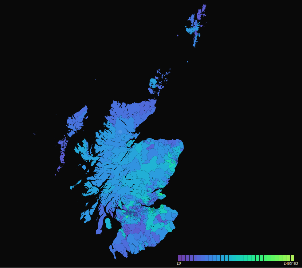
2. Colouring the boundaries
The main magic happens in the render function. It's a long one, so let me break it down.
2.0 Reading user selection
The function starts by checking which radio button the user has selected, and keeping a track of that in selectedColumn.
const selectedColumn = d3.select("input[name='column']:checked").node().value || "combinedLower";
2.1 Calculating the colour scale
Once the relevant data column is identified, the function extracts the house price values and calculates min and max values. These define the range for the colour scale using D3's scaleSequential and interpolateCool functions.
const values = combinedPrices.map(d => d[selectedColumn]);
const minMax = d3.extent(values);
const color = d3.scaleSequential(minMax, d3.interpolateCool);
The resulting 'color' here, is a function that when passed a number, will turn that number into a colour value.
2.2 Rendering the legend and boundaries
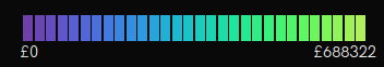
We first use the color function when generating the legend. This appears as a little gradient at the bottom right of the visualisation. The number of steps are controller by the numIntervals loop:
const intervalValues = [];
for (var i = 0; i < numIntervals; i++) {
    intervalValues.push(i * (minMax[1] / (numIntervals - 1)));
}

legendColours.selectAll("div")
    .data(intervalValues)
    .enter().append("div")
    .attr("style", function(d, i) {
    return "background: "+ color(d) +"; width: " + lWidth + "px";
})

legendNumbers
    .selectAll("div")
    .data(intervalValues)
    .enter().append("span")
    .text(function(d) { return "£" + Math.round(d); });

const areaPaths = areasGroup.selectAll("path")
    .data(geoFeatures.features)
    .enter()
    .append("path")
    .attr("data-centroid", (d)=>{ return JSON.stringify(pathDefiner.centroid(d)) })
    .attr("d", pathDefiner)
    .attr("title", (d) => { return d.properties.Name })
    .attr("id", (d) => { return "g-" + d.properties.InterZone; })
After rendering the legend, we render each region as a path element. Attaching some data, title, and id attributes acts as a handy reference for further interaction and debugging.
2.3 Applying colours to the boundaries
We know what column the user wants to visualise, and we know how to turn the price values into a colour. The updateFill is responsible for using the color function and applying it to each geographic area (path element) on the map.
Our visualisation involves more than just visualising the chosen price value for each region, there's also the "amount to spend" in the mix too.
const updateFill = () => {
  const spend = (amountInput.node().value / 100) * maxAmount;
  amountDisplay.text("£" + Math.round(spend));

  areasGroup.selectAll("path")
    .attr("data-value", (d) => { return pricesMap[d.properties.InterZone][selectedColumn] })
    .attr("fill", function(d){
    const c = color(pricesMap[d.properties.InterZone][selectedColumn]);
    if (spend >= pricesMap[d.properties.InterZone][selectedColumn]) {
      return c;
    } else {
      return d3.color(c).copy({ opacity: 0.1 });
    }
  });
};
The first thing updateFill function does is read the user's budget input from the range slider (amountInput). It then calculates the corresponding monetary value (spend) based on this input, and updates amountDisplay label beside the slider.
The function then iterates over all the map areas (path elements) and updates their fill color based on the calculated spend. The 'budget' condition spend >= pricesMap[d.properties.InterZone][selectedColumn] basically determines whether or not opacity is applied to the region's fill colour.
This is what creates the 'blackening out' effect when you decrease the amount available using the slider.
Note, D3 has really neat functions for parsing and manipulating colour spaces. In this case, using d3.color to parse the colour value and apply opacity of 0.1.
3. Event handling
Since the user can change a number of things about the visualisation, there's a bit of event handling going.
amountInput.on("input", updateFill);updateFill is called in two places, i.e. whenever the user interacts with the amountInput slider, and at the end of the render function itself.
render itself gets called once at the end of the script block, so the visualisation shows when the page is first loaded. It is also called when the user selects a different radio button.
const radioButtons = d3.selectAll("input[name='column']");
radioButtons.on("change", render);
As you'll have noticed, there's quite a lot going on in render, but it needs to be that way since we have different min and max values, so therefore the colour scale needs to change in line with the selected columns.
Advanced zoom interaction
You may be wondering what's going on in the zoom handler code as its a bit more extensive than the starter example in Part 1.
When you zoom and pan the map, the visualisation highlights the highest and lowest sale price data on the map with a little circle and label.
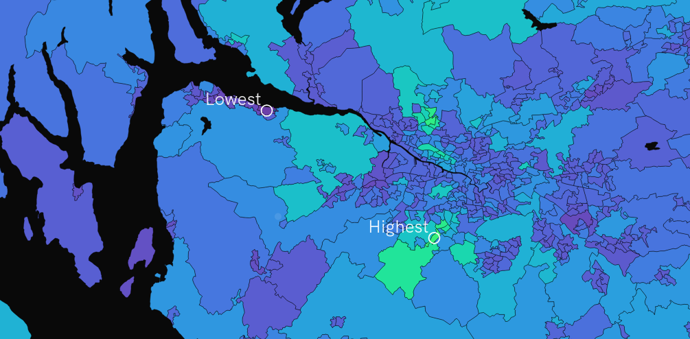
There's a lot to it so I'm going to write a dedicated post on how this bit works – especially as its one of the more challenging features of a visualisation I've worked on!