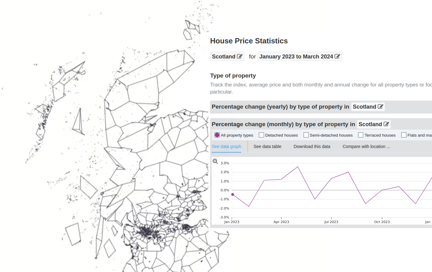
Looking at the stats, the 'Choropleth code walkthrough' has been the most popular post/video by far. On that note, I thought I'd do another Choropleth map. This time I've sprinkled in interactivity to demonstrate d3's 'update' behaviour. In this post, I'll outline the rationale for the visualisation and how to prepare the data for it.
The Visualisation
Sometime soon I'd like to move house. If you've ever been in this position, the market somewhat comes to dominate your thoughts: where can I buy? how much can I sell for? etc.
All sales (where I live) in Scotland are recorded by the Registers of Scotland (RoS) and that data is published openly on the government's stats portal.
Those figures are made available for various boundaries including what's called '2011 Intermediate Data Zones' – for a fairly high resolution choropleth map. Here below is the end result:
The slider controls allows you to choose an amount available towards a house. Areas above or below the value selected are dimmed or activated depending whether you go over a lower quintile, median, or mean value (also controllable).
Getting Price Data
The map reflects data collected for 2021 and 2022. This is the most up-to-date data that was published by the RoS. Other years are available all the way back to 2004 (in this dastaset anyway).
Although the dataset goes to 2022 there are inflation statistics that can help the prices reflect a more recent value. For this I used the UK House Price Index's monthly percentage change for Scotland from Jan 2023 to Feb 2024.
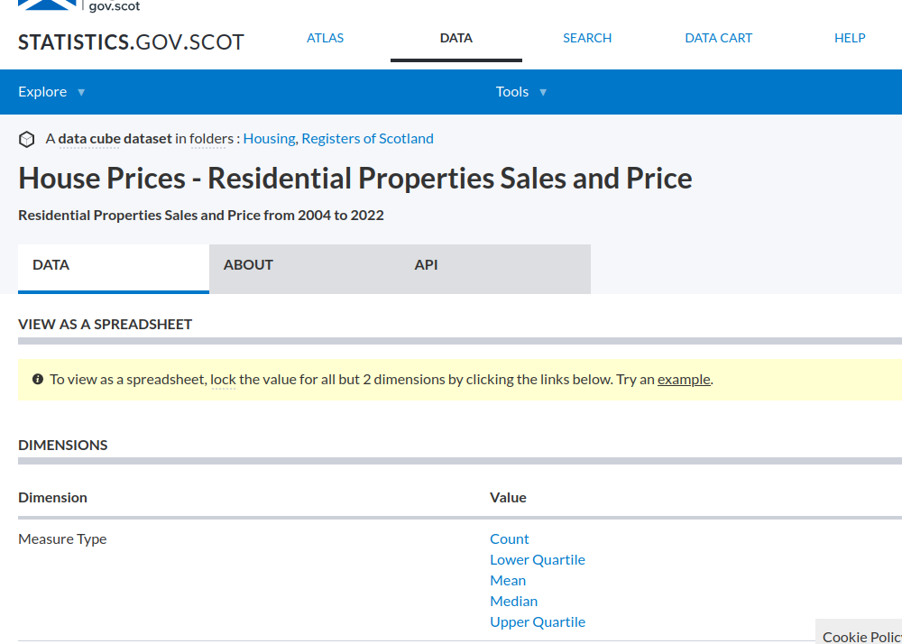
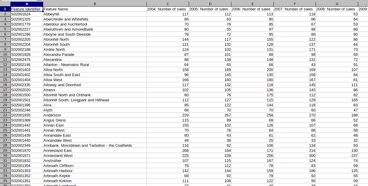
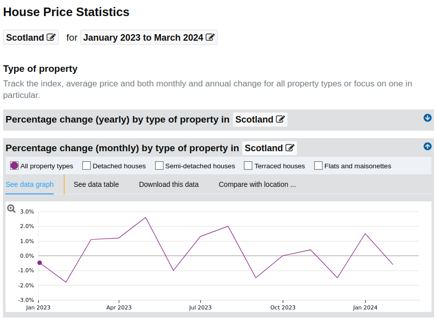
The pricing dataset exported from the stats hub was in great condition so I didn't have any cleaning to do. The only thing was figuring out how to actually export the data I wanted using the 'data cart' feature. The thing that threw me off was needing to navigate away from the dataset to the 'Atlas' in order to add desired rows to the export. It's not immediately intuitive so you need to read the guide rather than jumping in as I usually like to do.
Here's a video of the process that might be help:
Preparing the Boundary Data
The Scottish stats hub has a companion spatial data hub - spatialdata.gov.scot where you can download various open boundary data. In this case, the 'Intermediate Zone Boundaries 2011'.
The boundaries come as ESRI Shapefiles, so they need some conversion before we can use them with the d3-geo functions. For this purpose, MapShaper is a tremendous tool that does what we need.
At first I used the MapShaper GUI to open the Shapefiles, and before converting to TopoJSON simplify the map boundaries somewhat.
Troubleshooting a broken map export
When I first exported to TopoJSON and attempted to render the map with D3 I saw nothing. Fiddling with the projection parameters I was able to produce a big mess. Inspecting the boundary paths I could see the 'd' attribute had 'NaN' scattered throughout what should be a string of coordinates. If you know your JS, NaN = "Not a number".
The step I left out was to specify the coordinate system. On this topic, I can recommend this tutorial by Flourish. The fix was fairly simple. In Mapshaper you can convert CRS (Coordinate Reference System) using -proj.
Referring back to the boundary metadata show CRS (EPSG:4258), so the command I needed to run was:
-proj from=EPSG:4258 crs=EPSG:4326
NB- Once you do this you'll see the map looks a little squashed, don't worry that's meant to happen!
Rendering the TopoJSON in D3
Naturally our start point is just visualisng the map data. I've put the code for this on Glitch.
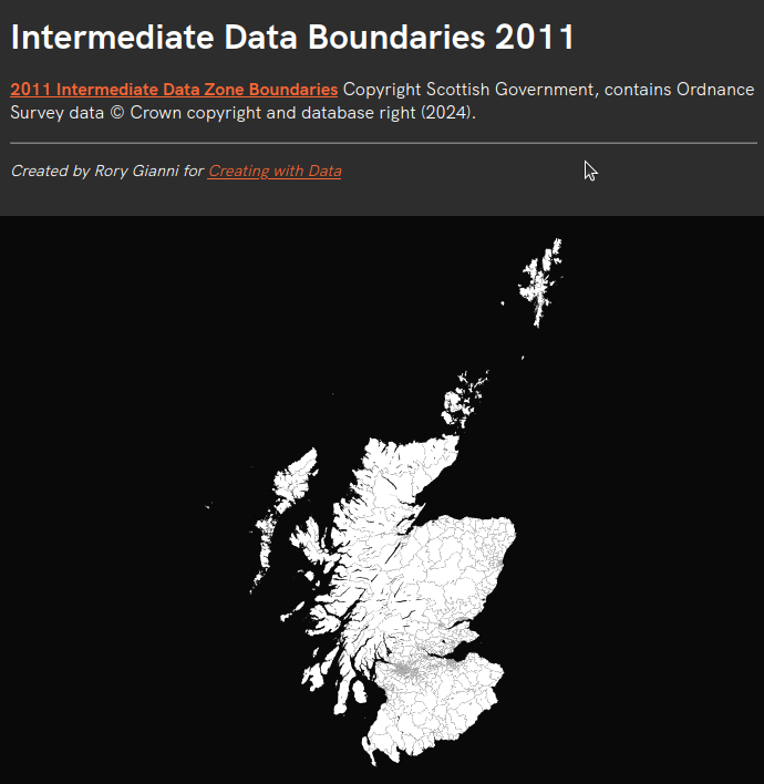
The above map is rendered in 22 lines of code, though most of the magic happens in just a few of these.
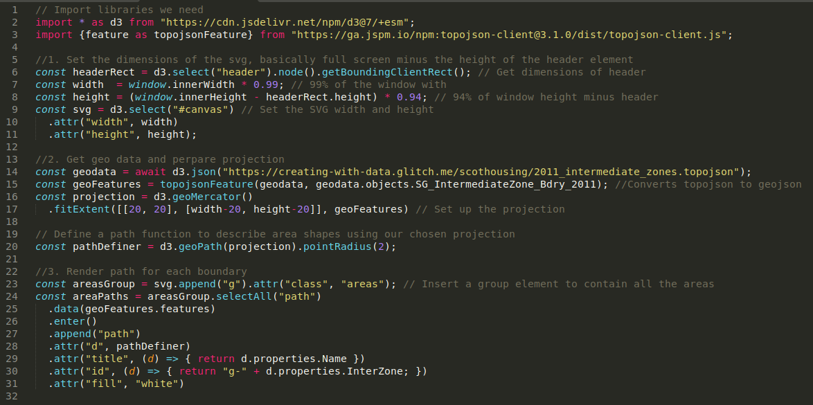
Lines 7-11: are just about sizing the SVG to fill most of the window minus the size of the header.
Lines 14-17: After that, we grab the TopoJSON file we generated using mapshaper. d3-geo uses GeoJSON, but since TopoJSON is a much more compressed format you'll frequently see people use TopoJSON with the topojson-client library to make the final conversion on the client side.
After we have GeoJSON, called geoFeatures here. We can configure our d3 projection with the GeoJSON data plus details about how we want to render the map - i.e. how we want to convert coordinates into x, y pixels that will make sense for SVG elements.
For this purpose fitExtent helps configure the projection by setting dimensions and centring the projection on the centre-point of our boundary data rather than the default coordinates (0°N 0°E ).
Lines 20-31: Once we have a projection function defined, we use this create our pathDefiner function. This is the geographic path generator, the function that will take coordinates and turn them into SVG Path parameters.
The data zone boundaries are collected in feautres as an array. This is what we use for our data binding, so for each GeoJSON feature we append a path element. The pathDefiner is then used to set the "d" attribute which describes the shape of the path.
Zoom and Pan behaviour
Beyond just displaying the map, we have some zoom and pan behaviour.
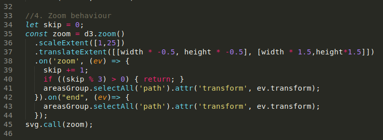
D3 helps you define this behaviour with d3-zoom module. Basically it helps you work out how to transform SVG elements when you drag or scroll-in / out. That's what happens here, where I select all path elements in the areasGroup, and updating the "transform" attribute.
You'll see how this works if you open the element inspector and move the map around.

You might be wondering what the skip % 3 condition is doing here. This isn't strictly necessary. It's a way of debouncing the 'zoom' event as I noticed the zoom behaviour was a little slow on mobile. Simplifying the map boundaries would be another way of dealing with this issue.
Looking ahead
If you've inspected some of these path elements you'll have noticed ids for each of these boundaries. These match up with the boundary ids we have in the sale prices spreadsheet. In part II I'll cover matching these up so we can shade each boundary using d3.scaleSequential and d3.interpolateCool.

On that note, you can always view or remix the full visualisation's code on Glitch.
